
Five tips to make your t-shirt design pop
Designing your own t-shirt (or other custom garment) can at first seem as daunting as facing a blank canvas. With the oShirt app we’ve provided you with the tools to make designing t-shirts easy and fun but these five tips can easily apply to anyone using photoshop or other design tools.
1. Color
The interplay between garment color and what’s printed on it is right up there with your choice of typography (fancy word for which fonts you use).
As a general rule try to contrast colors as much as possible. Light colors or white on a dark t-shirt and dark colors or black on a light t-shirt.
Try one of these time timeless combinations to get you started.
White and red
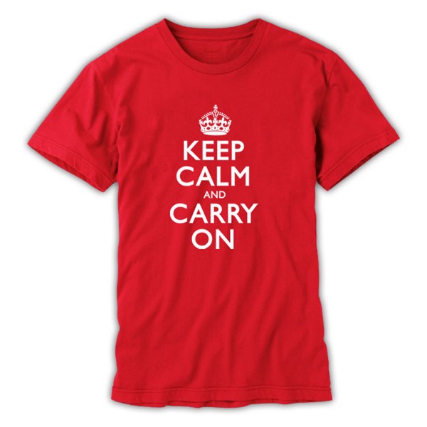
This high contrast combination is particularly good at making thinner design elements like narrow text stand out.
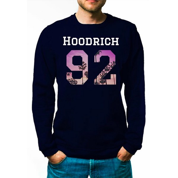
Blue and yellow
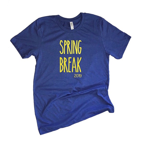
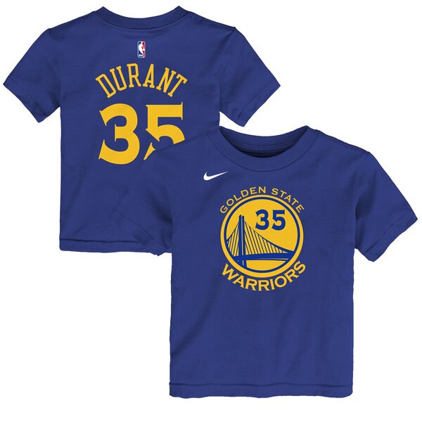
The warmth of yellow combined with the coolness of blue seem to add up together to feel very neutral.
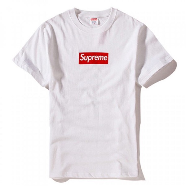
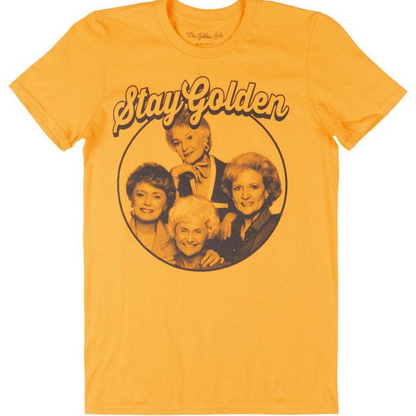
Black, white and red
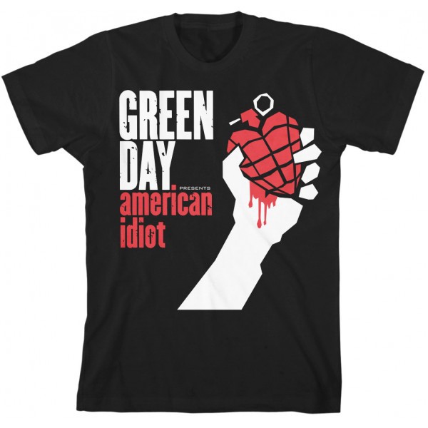
An edgy combination with a street feel to it. Often used for band shirts.
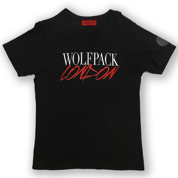
2. Typography
The choice of font can make or break a t-shirt design. When we think fonts we usually think Arial, Times New Roman, Helvetica etc. These fonts are great for the screen or in books as they make small text highly legible but when it comes to t-shirts and posters they can look incredibly bland.
Fonts can also change the mood of a design. We’ve compiled a list of some of the most popular fonts (in no particular order) used on hundreds of thousands designs made with oShirt. These are all available in the app along with many more and most can be found online (many at Google Fonts).
Luckiest Guy

Graduate

Peace Sans

Faster One

Permanent Marker

3. Flair
The oShirt app allows you to add text, shapes and photos. However, you may want to use text to get your message across as the main element.
That’s ok but considering adding some flair to your text. By flair I mean those little details that will make your design stand out.
My favorite is blocking in text with stars but you can also use hearts, ribbons or even kittens if that’s your thing.
4. Fill Text and Shapes
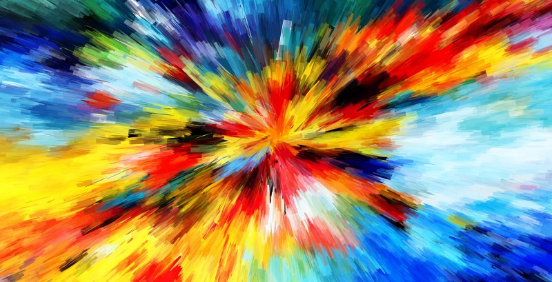
Photos and single color shapes can be boring. Try filling text with striking photos like sunsets and beach scenes and cropping your photos to shapes other than rectangles like circles, hexagons etc.
5. Space
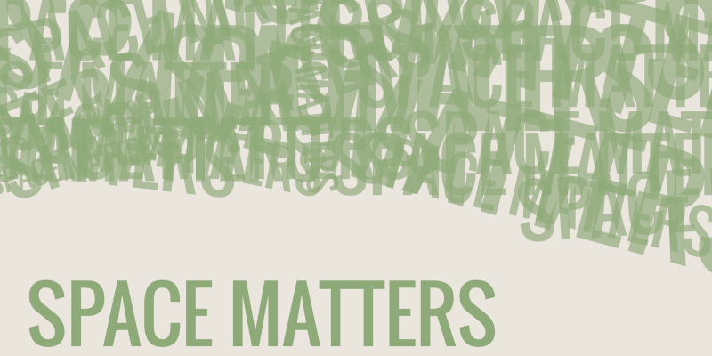
Don’t jam things together too closely. Unless they’re meant to be touching, don’t have elements up against each other. Most importantly don’t overcrowd your design.
A good t-shirt design should have at most three lines of text. If you can’t say it in that then consider using imagery or shapes to convey your message instead. Apart from flair your design should also only have a maximum of three to four components to it in total.
Summary
I hope these tips have helped give you some inspiration. Most of what you see here can be done in photoshop but the oShirt app available for Apple devices (iphone/ipad) and Android phones and tablets is made from the ground up to help you design high resolution designs for custom garments. What might take hours with traditional design tools can be achieve in less than a minute with oShirt so I highly recommend trying it out.