
5 Common T-Shirt Design Mistakes and How to Avoid them

Whether you are designing a sweatshirt for your sports club, a hoodie for father’s day, a onesie for your sister’s new baby or an awesome piece of swag for your business you’ll enjoy these tips.
This article will show you some of the most common mistakes we see people make when using the oShirt custom t-shirt design app (available on iOS and Android) and how to avoid them.
Let’s dive right in with tip #1
1 — Size
This has to be the most common and easily avoidable mistakes made when buying custom garments. Make sure you check size guides rather than just go off small, medium, large etc. Any good description should also talk about the fit of the garment.
If in doubt go one size up — No one is ever going to not fit into a garment one size too big
2 — Contrast
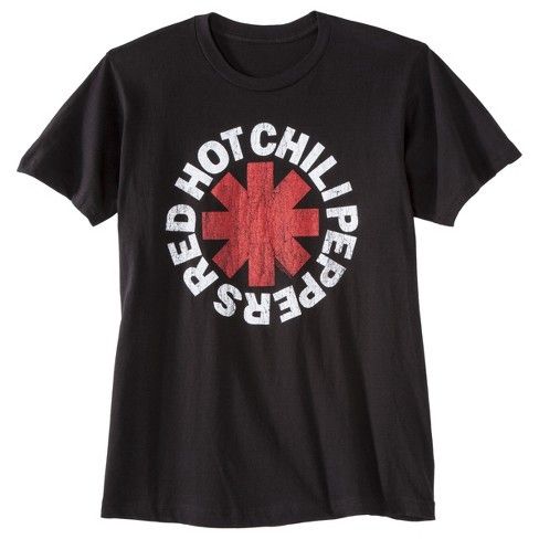
We see this mistake made all too often with oShirt as a lot of people get their bearings in the wonderful new design world. However, even experienced designers can make this mistake. Either way when it comes to unboxing your amazing new design it usually ends in tears
Avoid using dark colors on dark garments unless you’re intentionally trying to make things difficult to see. Navy blue text on a brown shirt is always going to be difficult to read. Even if it does look good on your expensive IPS monitor.
If in doubt fallback to using a white shirt. All but the lightest of lights will look good on white.
Primary colors on black or white shirts also work well. Any combination of red, black, white and blue look amazing.
3 — Image Quality
Another common mistake we see people make. When you take a small image that looks ok on a phone screen and blow it up on a 5XL hoody its over ten times bigger. Small photos can look pixelized. oShirt compensates for this somewhat by blurring your photos for you instead of leaving unsightly chunky pixels but it can only do so much. Photos from your phone or free stock photo sites should not have this problem but if you have downloaded photos from Google search results especially please check they are at least 4mp (4000x4000) or greater. If you’re not sure what I’m talking about then make sure the photo still looks good when you’ve zoomed in to two or four times larger than its normal size.
4 — Design Element Density and Size
Very fine detail, small text or very thin fonts are often difficult to discern on printed t-shirts. What might look ok in black and white on a piece of paper or even on your ultra sharp phone screen can be hard or almost impossible to read on a t-shirt.
Try to make sure your text height is at least 1/10 the height of your available design area. Use thick, bold fonts or make your text larger. The large selection of fonts available in the oShirt app have been specially selected based on their suitability for t-shirt design but you still need to stick to the 1/10th or larger rule.
If you’re using artwork or shapes please make sure the stroke on any pen-work is thick. If in doubt then squint at your design onscreen. Can you still make it out? You should be ok.
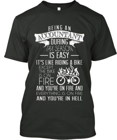
5 — Complexity
Some shirts just have too much going on. Think about it. You have less than a second to impress someone with your design. You aren’t going to do that with three photos and a paragraph of text as it could take a minute or more to process all of that.
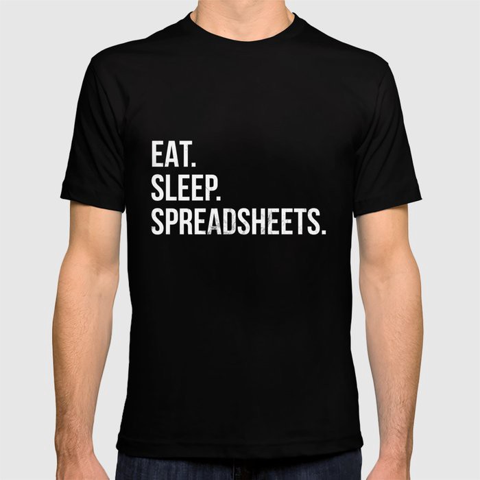
Two or three lines of text with two or three words each is ideal. A single photo or shape and some accompanying “flair” likes stars, underlines, basic shapes that your text is set against.
Let’s say you’re an accountant. You might think it’s a good idea to make this
Or…a simple message:
I hope this list has helped you both learn more about what to avoid but also design better. If you haven’t already tried oShirt then download it here. Even if you’re comfortable with photo shop and other design tools it’s a great way to quickly to try and share ideas and designs.
For more reading check out out our article on how to make your designs pop.
Have any mistakes to avoid or tips to help others? Join the conversation below.