17 tips to make your t-shirt designs look professional
It doesn't take as much effort as you might think to come up with a t-shirt design that exudes professionalism. Here's a list of tips that will have you designing amazing shirts in no time.
Note: Some of the tips also come with some information on how you can use them in the oShirt t-shirt design app for iOS and Android but they can also be easily applied to Photoshop or your favorite design tool(s).
1- Make use of custom fonts
Arial and Times New Roman are best left to MS Word documents and cheesy presentations at work.
If you're using a t-shirt design app like oShirt we have hand picked over a hundred of the best fonts for t-shirt design available but you can find thousands more fonts online with sites like dafont. Just make sure you follow the rest of the tips in this guide when choosing a font as not every font works well on a t-shirt
2- Remove the background from images
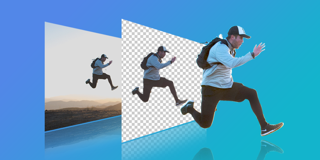
We see a lot of designs made with the oShirt app that would look a lot better with the background removed. Sometimes they have a plain white or colored background that could do with removal or often it's a portrait or other where it would look nicer with the background removed.
There are a plethora of apps available on iOS and Android if you just search for background remover. They do all vary in capabilities and appropriateness for different images so we can't recommend a specific one or even a list.
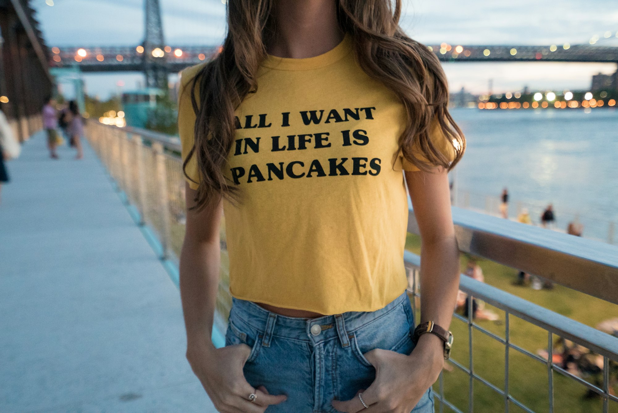
3- Create a color scheme that incorporates the fabric
Pick two or three colors for your design scheme and make sure one of them includes the fabric of the t-shirt itself. Eg a black shirt with red and white design or blue shirt with white and yellow. We covered this in more detail in five tips to make your t-shirt design pop.
4- Use a garment color other than black or white
Whilst there's nothing wrong with falling back to the old favorites occasionally there are more colors out there. The oShirt app alone has almost thirty colors to pick from.
5- Be your audience
If you are designing a tee for a streetwear brand then use lots of color and crazy fonts. However, if you're designing for an accounting firm it might be best to stick with one or two colours and and conservative fonts
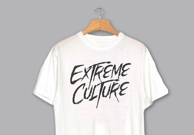
6- Make use of negative space
Negative space is simply where you cut part of the design out to expose the garment underneath. The cut part itself representing something.
OShirt has a "cut out" fill which can be applied to text or shapes which lets you cut out anything below. In the t-shirt above it was applied to the text which cut through the circle.
7- Less is more
For most designs try to stick with around three design elements at the most. Combine with be your audience. The more conservative your audience the less design elements. People probably don't want to have to stay really still so someone else can read the essay you printed on their chests.
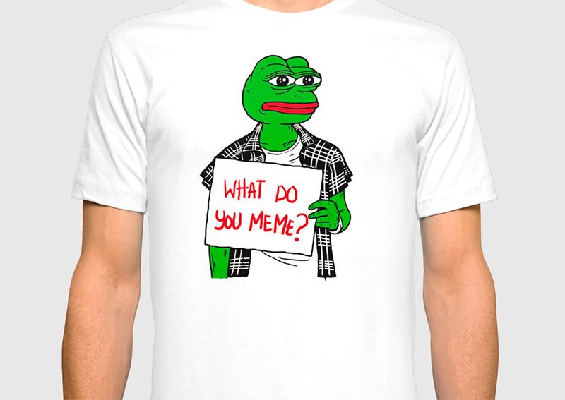
8- Be witty
People love a short, smart or funny piece on their shirts. Again combine with number 5. Memes were born to live on t-shirts but make sure it's not dated before the t-shirt even gets printed.
9 - Font spacing is key
Don't just stick with the default font spacing and heights when adding text. Even changing the character spacing can make the difference between a hit and a flop.
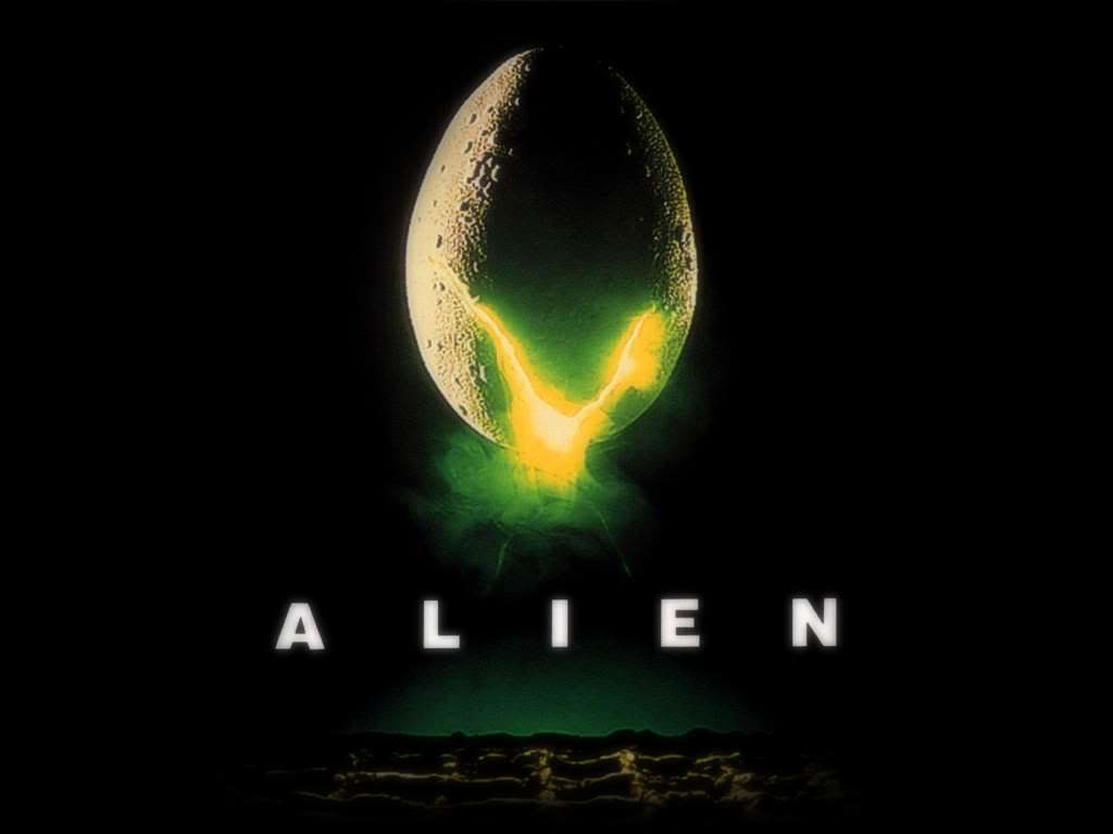
Remember this movie poster? The font used for the title sequence and poster for Alien is one of the most used fonts of the 20th century - Helvetica Black. The dramatic spacing totally changes the aesthetic of a very common font.
With oShirt you can set the letter spacing, the line spacing and even the height of text allowing you to shrink and grow your typography.
10- Make use of clipart & stock photos
Not the stuff they used to sell on CDs in the early 2000s. These days you can find a lot of quality shapes and photos that relate to your subject or can be used as flair. Oshirt has millions of shapes and photos just a tap away from your design.
11- Fill text and shapes with photos and textures
Plain colors are so yesterday. Make use of photo textures. The example below says it all.
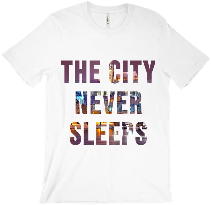
Oshirt lets you fill text and shapes with just a couple of taps. Something that in Photoshop is a 5-10 step process.
12- Square photos are boring
Ok they can work well but why not try cutting them to a shape. Basic shapes like diamonds, circles and stars are very popular but why stop there?
13- Position matters
If your design doesn't cover the whole tee then keep it in the top third. This way it will be across the wearer's chest rather than their belly.
14- Think in reverse!
When designing your t-shirt you are seeing what everyone but the wearer sees. The person wearing it will only ever see it in the mirror. For most designs it won't matter at all but often it's worth just holding your design up to a mirror or use a design tool to just flip it quickly.
15- Flow
Note: This changes depending on where in the world you are. I'm speaking for western cultures. People tend to start at the top left and move down to the bottom right so unless your intention is to disrupt this try to design to this and keep text flow natural.
16- Size matters
Most people are going to be looking at your t-shirt from about six feet or more away so newspaper sized print won't be readable. There's no hard and fast rule here but try to keep it at least 1/5th the height of the design area. Photos should be even bigger, preferably half the height of the area.
17- Contrast
This may seem obvious but we see so many people putting black , navy blue or very dark grey design elements on a black t-shirt. On a high end mobile phone you might see the difference but from six feet away on a tshirt it all looks black. Use red/white/yellow/pink etc on dark garments. On white garments you can use pretty much any color but white
Hopefully these tips have helped you in your journey to become a master t-shirt designer.